Introducing our new brand
The Rebrand
Over the last 2 years SML has been liaising with stakeholders to understand the nature of the businesses within our industry.
For all of those who participated in our branding surveys and workshops we thank you for the time and input you have made. Throughout this time, you have told us that the Fresh Produce and Flower industry is a vibrant, dynamic, and innovative space.
We also heard that our stakeholders have a desire for SML to take more of a proactive role to advertise the links between Sydney Markets and the businesses within it direct to consumers. We have heard you and have made “Maximising the Sydney Markets Brand” one of our strategic imperatives for the next 5 years.
An organisation as fresh, contemporary, and passionate as Sydney Markets deserves an identity and logo mark that conveys these very same qualities. There’s no better way to do this, than to tap into what is such an integral part of what we do – the seasons. It’s the seasons that allow us to deliver freshness all year round, therefore making it the pinnacle of our business.
With that, I am pleased to show you the results of the first phase of this strategic imperative by revealing our new corporate identity.
For over 25 years, Sydney Markets’ branding has stood the test of time. With this new brand we wish to reflect the vibrancy and innovation of our stakeholders and announce to the world that Sydney Markets will continue to modernise in line with the industry.
The Story Of The Logo
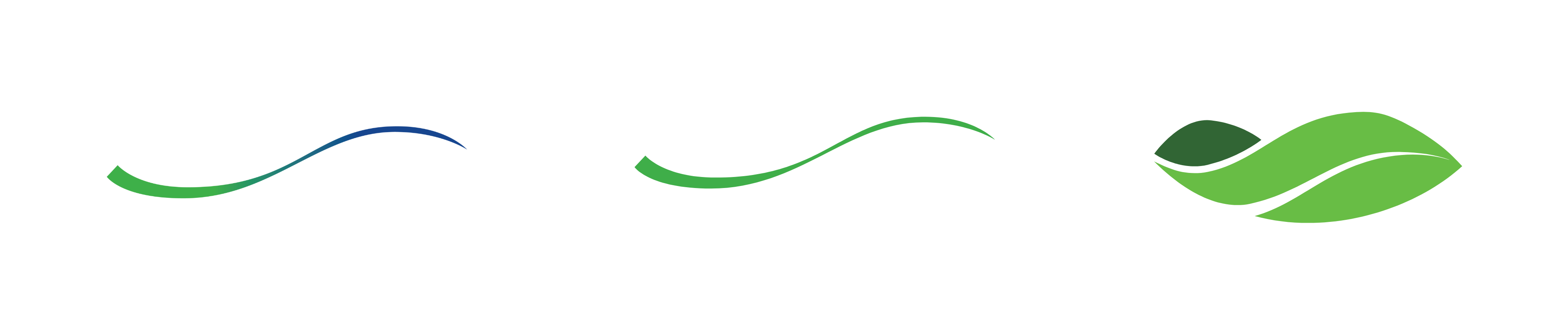
The choices we made when we created this logo were deliberate. The brand mark represents the four seasons and the change each one brings. The colours are vibrant and energetic, symbolising the diverse products found at the Markets, from flowers to vegetables.
The leaves are also an indication of the seasons and the ever-changing flow of life. The shape represents the cyclical nature of the seasons as well as the end-to-end logistics and holistic services that link farm to plate, built through people, relationships and scale.
The font has been designed as another representation of the Markets. The letters are perfectly imperfect, they are authentic like our produce and our people.
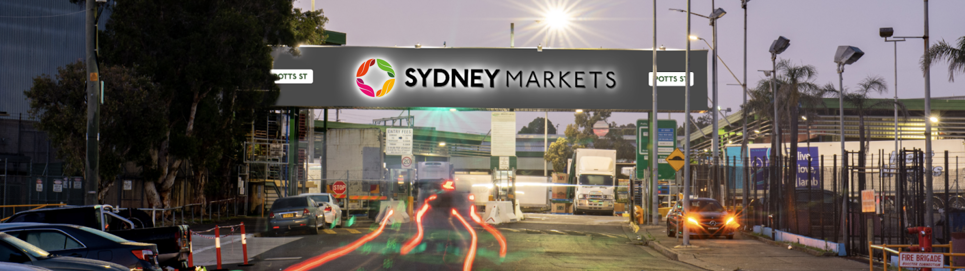
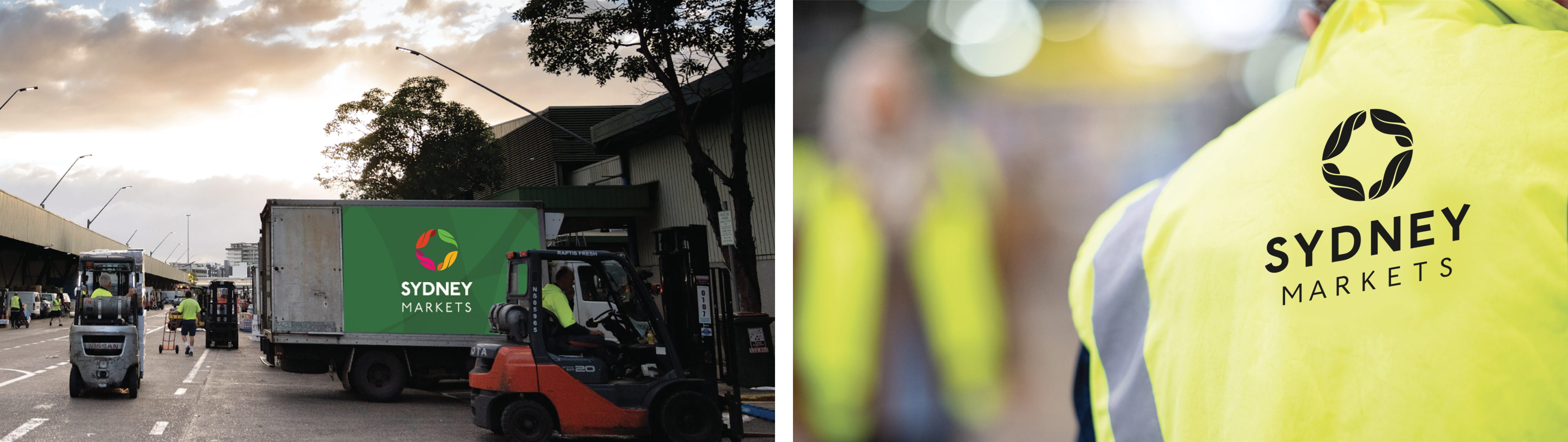
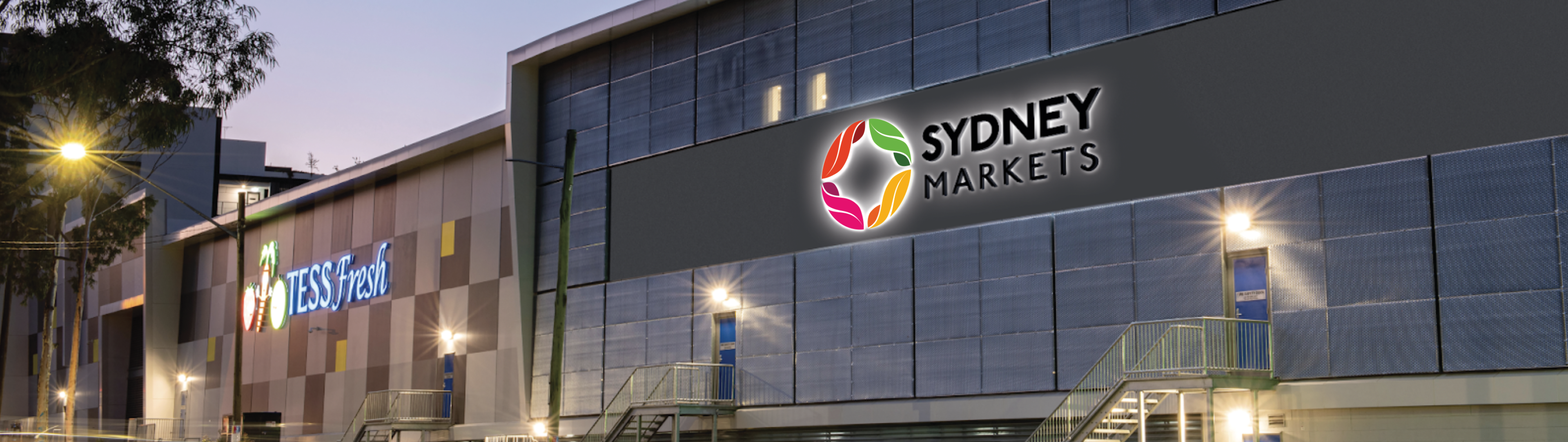
Keep a look out for our new logo around the Markets!

Brad Latham,
Chief Executive Officer